Angular Material Theming
Angular Material Theming
Demo: https://ajonp-lesson-10.firebaseapp.com/kitchensink Angular Material is the officially supported components for implementing Google’s Material Design System within Angular. There are 4 pre-built themes that come with Angular Material
- deeppurple-amber
- indigo-pink
- pink-bluegrey
- purple-green We are going to take a look at creating our own theme and including this in with our default style, then using this to provide mixins for each of our components styles.
Probably the biggest complaint that I hear about Themes in Angular Material is the requirement for building an entire new set of css using the sass function, which bloats your style.css files. Please checkout Ionic CSS Variables to see a comparison of how this can be accomplished. As of writing this still remains an open issue on GitHub
Lesson Steps
- Kitchen Sink Component
- Angular Flex-Layout
- Angular Material Theme Creation
- Theme Selection Angular Service
- Sass Mixins
- Tools
Kitchen Sink Component
In English (maybe just USA) we say “Everythign but the kitchen sink”, in programming we often will use the “Kitchensink” to refer to everything we can possible use on a site. For our example we will pull from the Angular Material Kitchensink so that we can highlight all of the possible components and what the theme does to them.The components can be found on material.angular.io/components there are a few from the Component Dev Kit (CDK) as well.
Clone Repo
Usually I would offer up a guide to build this entire thing out (and I show this in the video if you want to follow along) but to simplify things I am recommend you just clone the Lesson 10 repo (or fork it and clone yours) and check it out for this walk through.
git clone <https://github.com/AJONPLLC/lesson-10-angular-material-theming>
If you would like to follow along you can snage the Lesson 9 and work with me through the updates.
git clone <https://github.com/AJONPLLC/lesson-9-angular-material-router-outlet>
Angular Flex-Layout
Angular FLex-Layout or fxLayout, offeres a great alternative to creating all the css for a flexlayout by hand. It is very similar to Bootstrap’s Flex but I feel as though it is even more powerful.This is a great example by tburleson:
Toolbar
For our example we used the nogrow option in the toolbar so that the material icon would stay shifted off to the right using fxFlex="nogrow".sidenav.component.html
<mat-sidenav-container>
  <mat-sidenav opened="false" mode="over" #snav>
    <mat-nav-list>
      <mat-list-item>
        <h4
          matLine
          routerLink="/welcome"
          [routerLinkActiveOptions]="{ exact: true }"
          routerLinkActive="active-link"
        >
          Home
        </h4>
      </mat-list-item>
      <mat-list-item>
        <h4
          matLine
          routerLink="/kitchensink"
          [routerLinkActiveOptions]="{ exact: true }"
          routerLinkActive="active-link"
        >
          Kitchen Sink
        </h4>
      </mat-list-item>
      <mat-list-item>
        <h4 matLine routerLink="/books" routerLinkActive="active-link">
          Books
        </h4>
      </mat-list-item>
    </mat-nav-list>
  </mat-sidenav>
  <mat-sidenav-content>
    <mat-toolbar color="primary">
      <button
        type="button"
        aria-label="Toggle sidenav"
        mat-icon-button
        (click)="snavToggle(snav)"
      >
        <mat-icon>menu</mat-icon>
      </button>
      <span fxFlex>
        <a class="home-link" routerLink=".">{{ title }}</a>
      </span>
      <span fxFlex="nogrow">
        <button mat-icon-button [matMenuTriggerFor]="menu">
          <mat-icon>format_color_fill</mat-icon>
        </button>
        <mat-menu #menu="matMenu">
          <button mat-menu-item (click)="pickColor('')">
            <div class="color-swatch color-swatch-primary" mat-menu-item></div>
          </button>
          <button mat-menu-item (click)="pickColor('green')">
            <div class="color-swatch color-swatch-green" mat-menu-item></div>
          </button>
          <button mat-menu-item (click)="pickColor('pink')">
            <div class="color-swatch color-swatch-pink" mat-menu-item></div>
          </button>
          <button mat-menu-item (click)="pickColor('purple')">
            <div class="color-swatch color-swatch-purple" mat-menu-item></div>
          </button>
          <button mat-menu-item (click)="pickColor('yellow')">
            <div class="color-swatch color-swatch-yellow" mat-menu-item></div>
          </button>
          <button mat-menu-item (click)="pickColor('warn')">
            <div class="color-swatch color-swatch-warn" mat-menu-item></div>
          </button>
        </mat-menu>
      </span>
    </mat-toolbar>
    <router-outlet></router-outlet>
  </mat-sidenav-content>
</mat-sidenav-container>
Kitchensink
In our kitchensink example we wrapped every component with a <span fxFlex>, then wrapped the entire component in <div style="max-width: 80%" fxLayout="column" fxLayoutAlign="center center"> which will allow everything to stay in the center and each of the fxFlex items to be within a flexbox. You can see that each span will have the style flex: 1 1 1e-09px;box-sizing: border-box; when rendered in the html.
Angular Material Theme Creation
You could use the 4 prebuilt themes that come with the @angular/material package, by just importing them into your style.css@import "~@angular/material/prebuilt-themes/indigo-pink.css";``@import "~@angular/material/prebuilt-themes/deeppurple-amber.css";``@import "~@angular/material/prebuilt-themes/pink-bluegrey.css";``@import "~@angular/material/prebuilt-themes/purple-green.css";
Custom Theme
I prefer to add them directly so that you can create your own branding colors. You can’t make a new unique site if you don’t allow for your Brand’s identity to show through (you know what I am talking about Marketing!).The best site I have found for this is Material Design Palette Generator unlike Google’s Material Color Tool, the DPG allows you to export direct to sass variables which is exactly what we need when creating an Angular Material Theme.Make sure when you choose download (the down arrow), you then choose ANGULAR JS 2 (MATERIAL 2).

Update theme file
You can then use all of these custom variables to create new themes. The sass variable should define the full spectrum along with contrast of each color in the palette.Please make sure you include all of the material sass theming functions by adding this to the top of any theme file. You should only have this once in any project, so if this makes more sense in your style file using various mixins and include features please do this in a way that makes sense for your project.
@import '~@angular/material/theming'; @include mat-core();
SASS Variables
angular-material-router-theme.scss
$md-purple: (
  50: #ffffff,
  100: #d3cbe7,
  200: #b2a5d5,
  300: #8974be,
  400: #775fb4,
  500: #674ea7,
  600: #5a4492,
  700: #4d3b7d,
  800: #403168,
  900: #342754,
  A100: #f9f7fd,
  A200: #b7a2ec,
  A400: #7c5dcb,
  A700: #7256b9,
  contrast: (
    50: #000000,
    100: #000000,
    200: #000000,
    300: #000000,
    400: #ffffff,
    500: #ffffff,
    600: #ffffff,
    700: #ffffff,
    800: #ffffff,
    900: #ffffff,
    A100: #000000,
    A200: #000000,
    A400: #ffffff,
    A700: #ffffff
  )
);
Creation of the Sass variable for our new palette, here the mat-palette function is returning the color information and mappings and assigning it to $angular-material-router-app-purple.
$angular-material-router-app-purple: mat-palette($md-purple);
New Material Theme
Once you have a new palette it is finally time to create a new Sass variable $angular-material-router-app-theme-purple that hosts your full theme information.
$angular-material-router-app-theme-purple: mat-dark-theme(
  $angular-material-router-app-purple,
  $angular-material-router-app-accent,
  $angular-material-router-app-warn
);
Please note I have used the default accent and warn, but you can make these any color that you would like as well. Then whenever you use color="warn" it could be purple or gray instead of red, please aroudnd with switching out the variables in any theme.
Style Class Update
At this point we have only created a bunch of Sass variables that are not included in our app anywhere. In order to do this we will include them in a surrounding class, this can be done in the style.scss file, this should have been generated by the Angular CLI, or it is already in the styles folder if you cloned the repo.
Import SCSS Theme File
First make sure you are including the new theme file that holds all of our variables, by importing the scss @import 'angular-material-router-theme.scss';.You can do this in any component to use the Sass variables.
Include Theme into class variable
Now we will include inside this class the entire theme (css) for our app.
...
.angular-material-router-app-theme-purple {
  $theme: $angular-material-router-app-theme-purple;
  @include angular-material-theme($theme);
}
...
Sidenav Color Selector
Now that we have all of our theme colors defined we can update the sidenav button clicks styles to include the correct background color, this assigns each menu item the color and with a border-radius of 50% makes it a circle.sidenav.component.scss
.color-swatch {
  position: relative;
  width: 36px;
  height: 36px;
  margin: 6px;
  border-radius: 50%;
  overflow: hidden;
}
.color-swatch-primary {
  background-color: mat-color($angular-material-router-app-primary, 500);
}
.color-swatch-primary:hover {
  background-color: mat-color(
    $angular-material-router-app-primary,
    500
  ) !important;
}
.color-swatch-green {
  background-color: mat-color($angular-material-router-app-green, 500);
}
.color-swatch-green:hover {
  background-color: mat-color(
    $angular-material-router-app-green,
    500
  ) !important;
}
.color-swatch-pink {
  background-color: mat-color($angular-material-router-app-pink, 500);
}
.color-swatch-pink:hover {
  background-color: mat-color(
    $angular-material-router-app-pink,
    500
  ) !important;
}
.color-swatch-purple {
  background-color: mat-color($angular-material-router-app-purple, 500);
}
.color-swatch-purple:hover {
  background-color: mat-color(
    $angular-material-router-app-purple,
    500
  ) !important;
}
.color-swatch-yellow {
  background-color: mat-color($angular-material-router-app-yellow, 500);
}
.color-swatch-yellow:hover {
  background-color: mat-color(
    $angular-material-router-app-yellow,
    500
  ) !important;
}
.color-swatch-warn {
  background-color: mat-color($angular-material-router-app-warn, 500);
}
.color-swatch-warn:hover {
  background-color: mat-color(
    $angular-material-router-app-warn,
    500
  ) !important;
}
Theme Selection Angular Service
You can read up on Angular Services and why you should use them.
Create color-picker Service
I like to create all of my services in a folder called core, I will often put other things like models in this folder as well.
ng g s core/services/color-picker.service
In this service we need to have an initial class set for the app in variable initialClass, if you follow the lesson video it shows how this works with local storage in the browser. This allows a person to set the theme and not need to select on refresh. So we look there first and if we cannot fild it we just add the initial class, which is what is also set to our BehaviorSubject. You will also notice we are updating something called OverlayContainer, this comes from the Material CDK and allows many of the floating panels to have style.color-picker.service.ts
import { Injectable } from "@angular/core";
import { BehaviorSubject } from "rxjs";
import { OverlayContainer } from "@angular/cdk/overlay";
@Injectable({ providedIn: "root" })
export class ColorPickerService {
  initialClass = "angular-material-router-app-theme";
  colorClass$: BehaviorSubject<string> = new BehaviorSubject(this.initialClass);
  constructor(private overlayContainer: OverlayContainer) {
    const storageClass = localStorage.getItem("color-picker");
    console.log(storageClass);
    if (storageClass) {
      overlayContainer.getContainerElement().classList.add(storageClass);
      this.colorClass$.next(storageClass);
    } else {
      overlayContainer.getContainerElement().classList.add(this.initialClass);
    }
  }
  getColorClass() {
    return this.colorClass$;
  }
  setColorClass(className: string) {
    this.overlayContainer.getContainerElement().classList.forEach(css => {
      this.overlayContainer.getContainerElement().classList.remove(css);
    });
    this.overlayContainer.getContainerElement().classList.add(className);
    this.colorClass$.next(className);
    localStorage.setItem("color-picker", className);
  }
}
Update App for Theme Class
Now that we have all the underling items taken care of we need to actually update the app’s class on the fly. This is again why I like to create everything in Modules away from the app component, because it makes this part look very clean.You will add the behavior subject to the entire app just by adding [ngClass]="themeClass | async". This will take the last Observable string for the class name and assign in when the service broadcasts.app.component.html
<div [ngClass]="themeClass | async"><app-sidenav></app-sidenav></div>
We of course need to tell our html where this came from by updating our app.component.ts file by using dependency injection to add our new color-service.app.component.ts
import { ColorPickerService } from "./core/services/color-picker.service";
import { Component, OnInit } from "@angular/core";
@Component({
  selector: "app-root",
  templateUrl: "./app.component.html",
  styleUrls: ["./app.component.scss"]
})
export class AppComponent implements OnInit {
  title = "angular-material-router-outlet";
  themeClass;
  constructor(private colorPicker: ColorPickerService) {
    this.themeClass = this.colorPicker.getColorClass();
  }
  ngOnInit(): void {}
}
Sass Mixins
The easiest way to create color on those items that dont allow the color directive, is to create a mixin based on our current theme’s color. For instance in our kitchensink mat-grid-list does not offer color, but we can add it to the background by providing a mixin.
Add Mixin to Theme
angular-material-router-theme.scss
@mixin mat-grid-mixin($theme) {
  $primary: map-get(
    $map: $theme,
    $key: primary
  );
  mat-grid-tile {
    background-color: mat-color($primary, 500);
    color: mat-contrast($primary, 500);
  }
}
Include the mixin @include mat-grid-mixin($theme); update when each theme class is selected. Now anything with mat-grid-tile will receive the background color of the current primary theme color. You can get any key that you want from the sass function map-get and use it in the mat-color and mat-contrast functions.
.angular-material-router-app-theme-purple {
  $theme: $angular-material-router-app-theme-purple;
  @include angular-material-theme($theme);
  @include mat-grid-mixin($theme);
}
Create Mixin outside of Theme
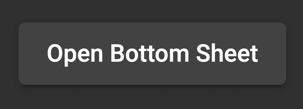
Lets say that just in our kitchensink example we want to make all the buttons switch from a standard radius

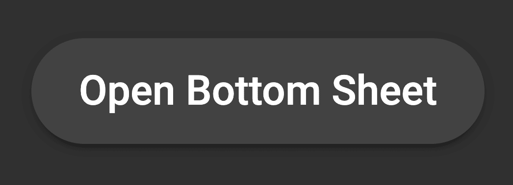
to a more rounded radius

We can add a new mixin fileangular-button-large-radius.scss
@mixin angular-button-large-radius {
  .mat-raised-button,
  .mat-stroked-button,
  .mat-flat-button {
    border-radius: 45px;
  }
}
Then just include this into our kitchensink sass.
@import '../../../styles/angular-button-large-radius.scss';
@include angular-button-large-radius;
Tools
Tools Used In Lesson
- Angular Flex-Layout
- Material Design Palette Generator
- Sass Guide
- Angular Material Theming
- Angular Material Kitchensink